NewPath
A New Identity For An Old Friend
Challenge
A lot has changed since St. Joseph Orphanage—now NewPath Child and Family Solutions—opened its doors in 1829. After recently becoming an independent non-profit, they needed a brand refresh to reflect that new status and their growing range of services. But such an important legacy meant a rebrand would require a great deal of listening and collaboration, with respect for the past and an eye on the future.
A new name and brand promise line were the centerpiece of aligning the agency with their current strategy. Needing buy-in from all corners, we involved stakeholders from the beginning. Clients, referral partners, donors, employees, board members and leadership teams took part in workshops, surveys and focus groups to develop concepts that reflected their expanding vision. This collaboration led to “NewPath.” Tangible and emotional, while touching on hope and potential, it acts as an uplifting first step that helps change the trajectory of their clients’ next stage of life.
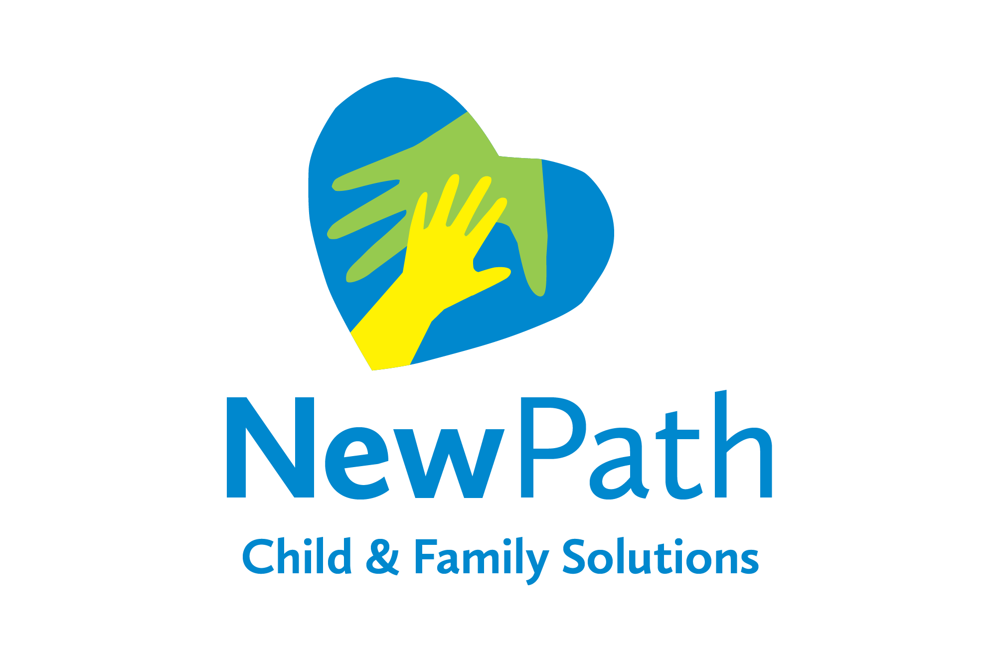
Like the name, the new logo needed to communicate “Igniting Hope. Changing Futures.” while being tangible and emotional. Again, we involved stakeholders to help refine initial concepts into the ideal encapsulation of their values. This input helped us gravitate away from depicting a literal path in favor of implying one. The larger hand guiding a smaller one drives home the message that children are at the center of their strategy. The heart also features cut paper edges, indicating that NewPath meets children where they are – rough edges and all. Compassionate, supportive, hopeful and vibrant, the logo acts as a signal that suggests a promising future.
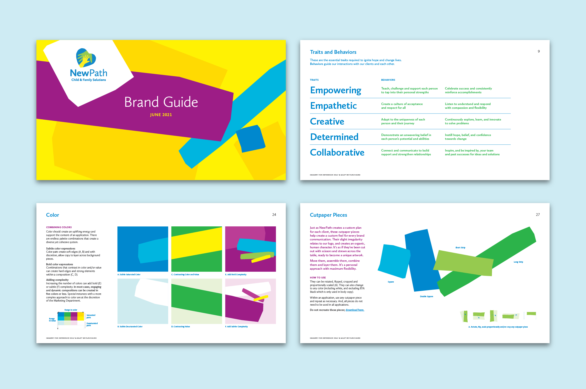
With buy-in on the logo and name, it was time to put the new look and feel into a package that NewPath could use to create all their touchpoints. The brand toolbox gathered key talking points and all the necessary logo and graphic elements into one convenient resource with instructions on how to express the new identity. It was a turnkey solution that put the power of the rebrand directly into the client’s hands.
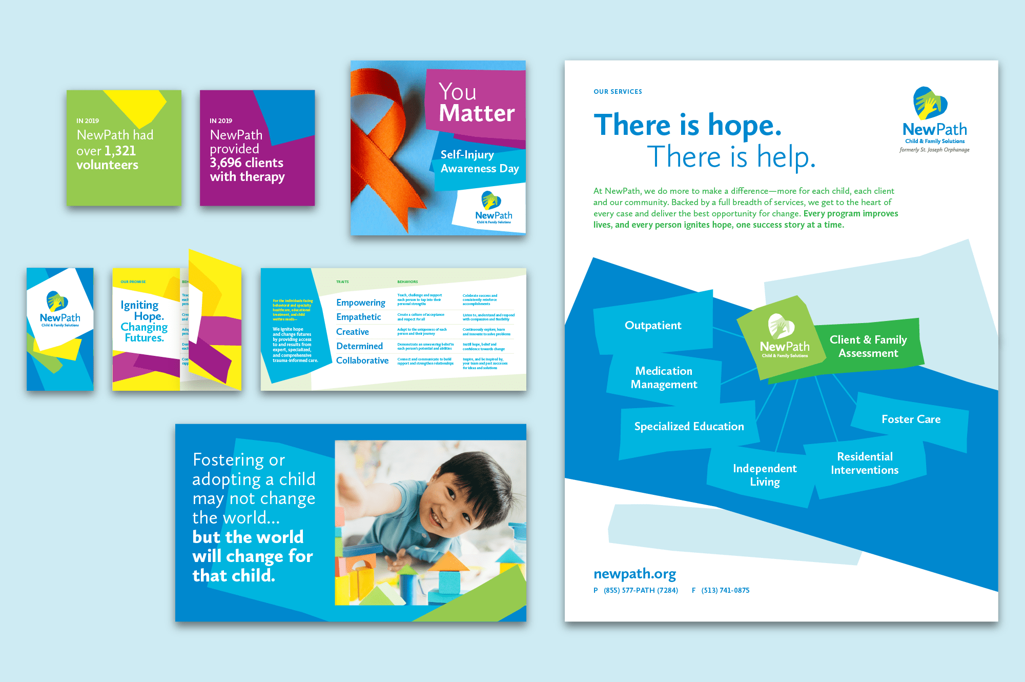
So everyone at NewPath was on the same page about what they do and how they do it, we also designed a series of support pieces including a capabilities sheet and a folding wallet card. This set of templates is a quick, easy, efficient (and totally on brand) way to distill NewPath’s brand promise and extensive services into easily digestible touchpoints.
To announce the new name and logo in an engaging way, we created a launch video that supplemented print and online touchpoints in digital channels. Cut paper graphics (brand elements) were animated to lead the viewer to the new logo and name reveal. Video helped put real, live faces to the brand and drive home who the organization truly serves.
