EyeMed BRAND
New Perspective, Same Brand
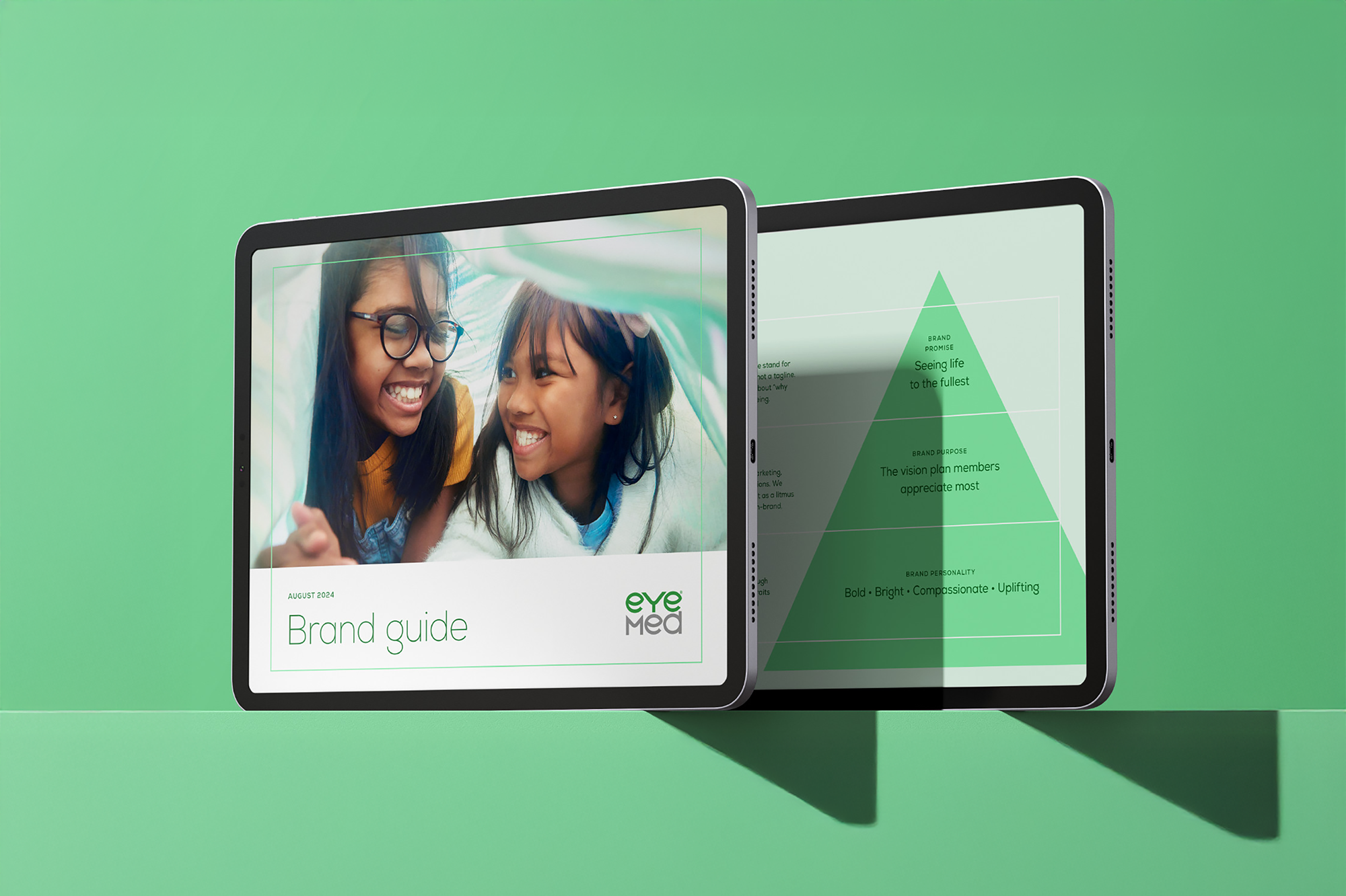
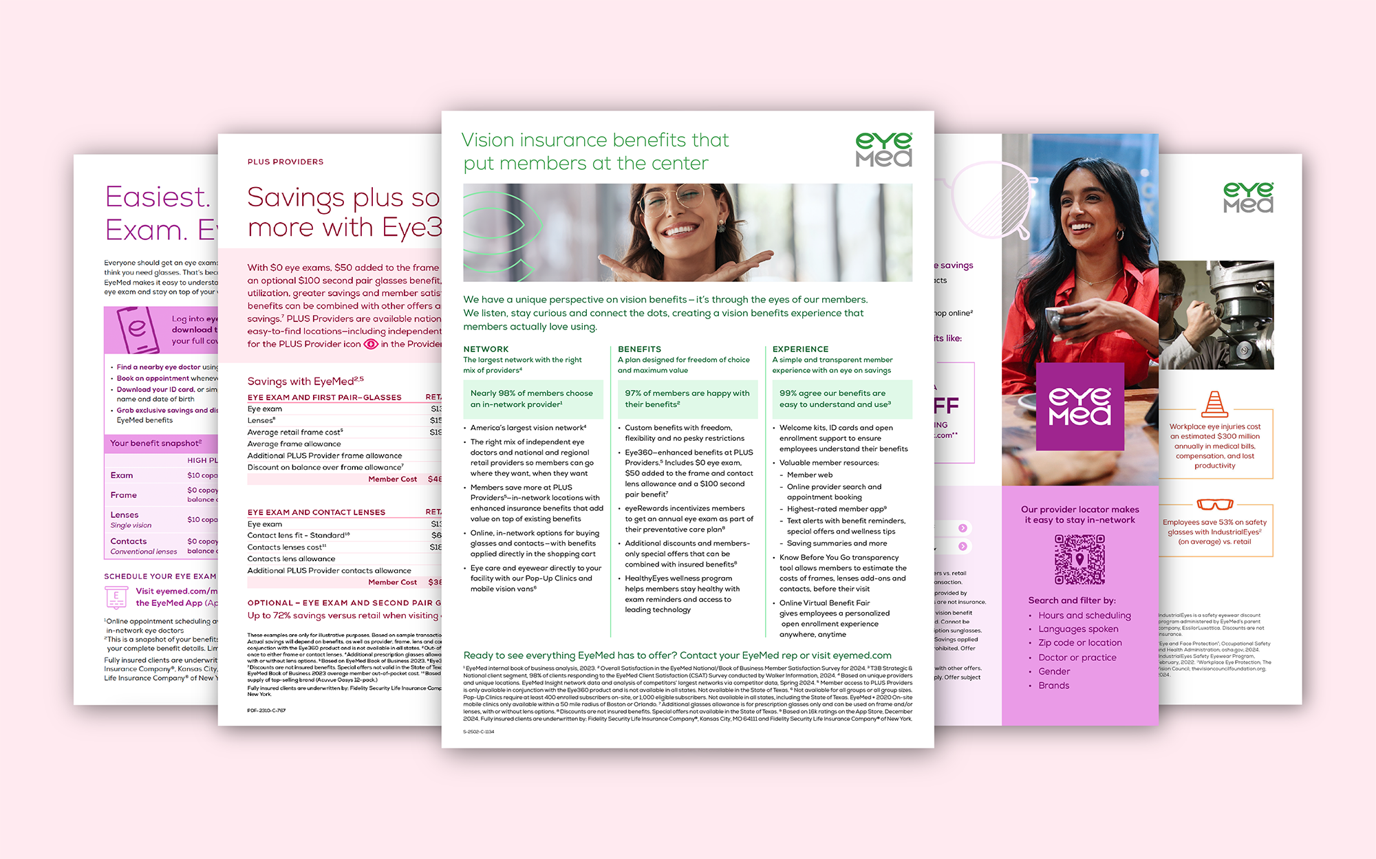
EyeMed asked us to update their brand to reflect the classic elegance of their parent company, EssilorLuxottica. Our refreshed brand elements were built in close collaboration with EyeMed to ensure they remained clear and flexible for a variety of use cases. We also built new brand guidelines to showcase how they’re designed to work together as a system and allow team members to combine elements for any piece of collateral. The result was a modern and functional evolution of the brand, seamlessly connected to EssilorLuxottica while staying true to EyeMed’s personality.
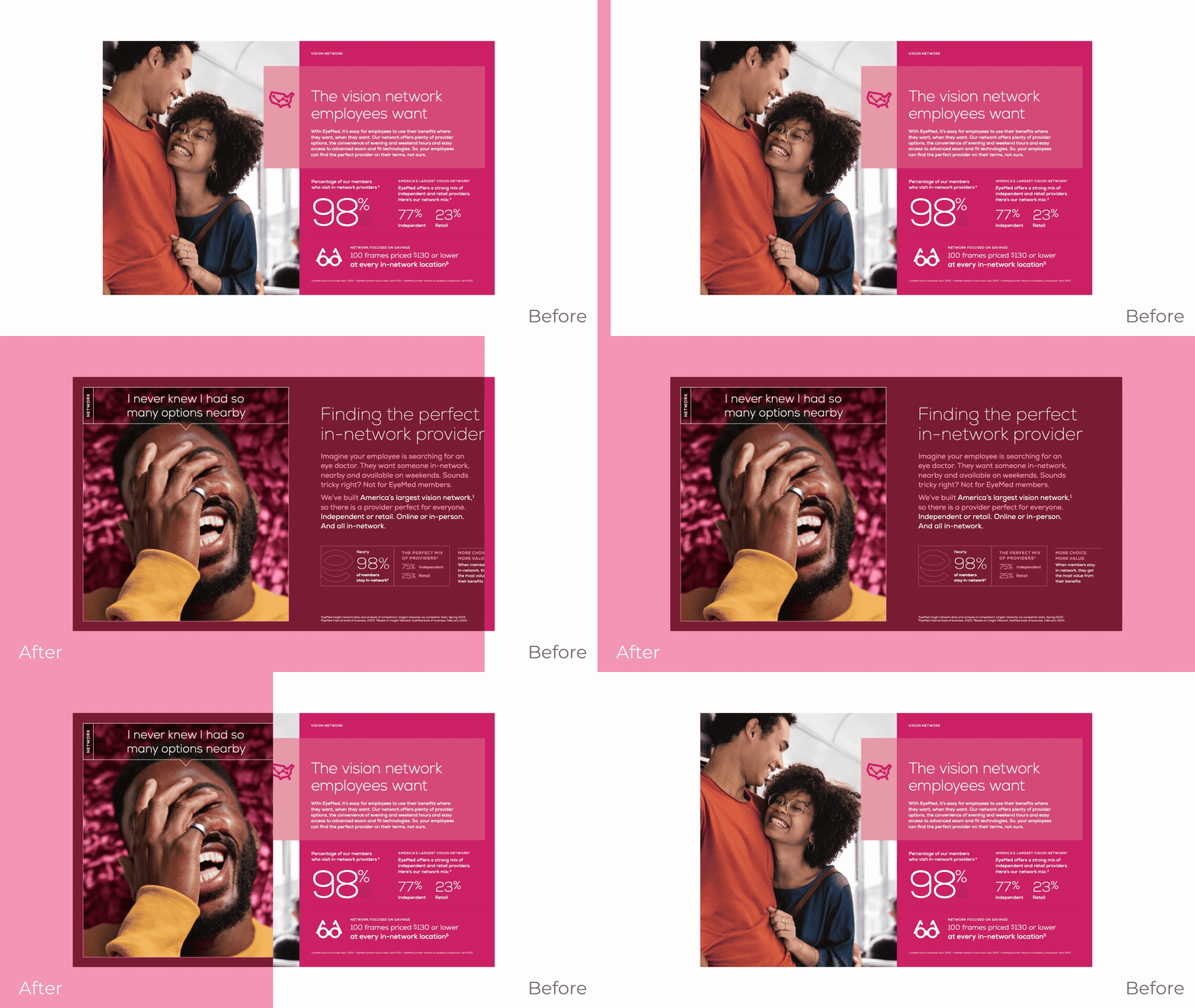
To create an elegant, modern feel, we developed helpful guides on how to use white space more effectively.
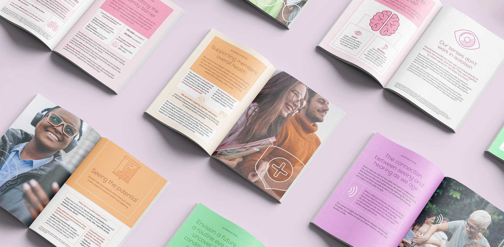
We considered things not just from a member’s point of view, but from the perspective of their internal brands, providers, brokers, benefits managers and other markets they reach on a daily basis.

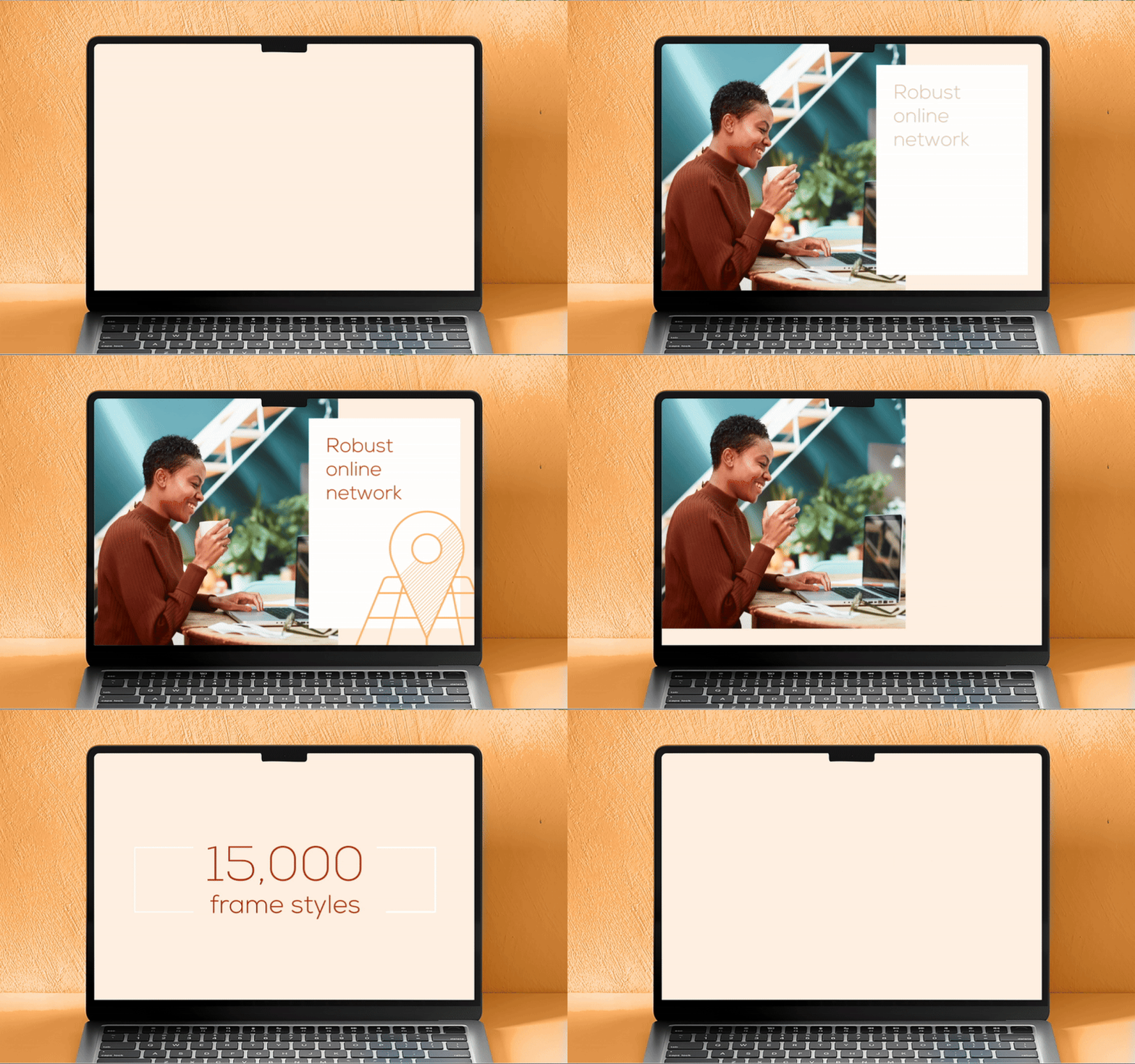
We brightened up and expanded the color palette, finding new ways to combine colors while maintaining ADA-compliant contrast. We developed new styles and updated each icon in EyeMed’s vast icon library to feel more relevant and support new brand messages.



Working with Madison is my favorite part of the day. Smart, strategic, talented, and always a delight, they make my job so much fun.
—David Shepherd
DIRECTOR OF CREATIVE AND MARKETING, EYEMED
